Redesigning Digital Experiences for Relevance, Engagement and Conversion

-
A financial literacy website was attracting traffic, but not enough meaningful engagement, retention, or calculator use. I helped turn an assumption-driven experience into a clearer, more relevant journey for both new and returning users, improving engagement, supporting conversion, and delivering the redesign within a three-month deadline.
-
This was not just a website refresh. The experience supported Capital Group’s B2B loyalty program and was intended to help employees of institutional clients increase their retirement contributions. Although targeted email campaigns were driving initial traffic, the site was not guiding users effectively once they arrived. Engagement was low, exploration was limited, and the key calculator experience was underused. At the same time, the redesign had to be completed within three months to support the onboarding of a new client with 70,000 employees.
Without cross-functional alignment, the risk was not just weak messaging. The bigger risk was that marketing, sales, and partner teams would operate from different assumptions, leading to inconsistent narratives, underperforming collateral, and missed growth potential in a future-facing area of the business.
The opportunity was to create shared clarity early, then build a broader ecosystem that connected product positioning, marketing deliverables, sales enablement, and success measurement.
-
Identifying why the site was not engaging users or driving enough calculator interaction. Reframing the problem from “more traffic” to “more clarity, relevance and better flow.” Redesigning the information architecture to better support both new and returning users. Leading a faster, leaner design process within a tight delivery window. Using AI and lightweight prototyping methods to accelerate ideation and collaboration across the team.
How I Approached It
-
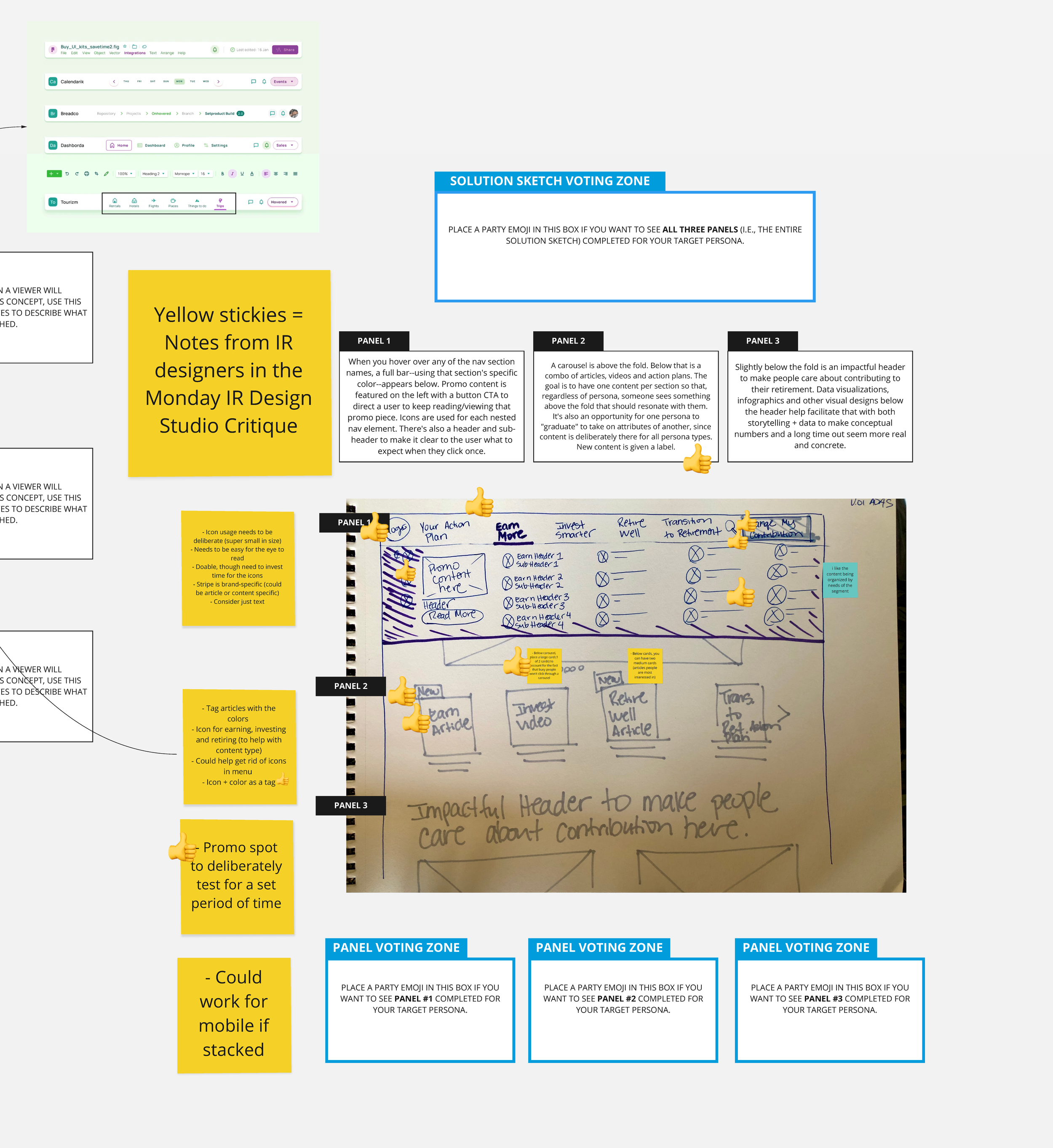
I conducted a full website audit, looking at both backend data and the front-end experience. I mapped the site’s information architecture in Miro to identify design inconsistencies, friction points, and technical issues that were making the experience harder to use.
-
The core issue was not a lack of content or campaign activity. It was that the site had been designed around the assumption that every visitor was new. That left returning users without a clear path and limited the site’s ability to build momentum over time. I also uncovered technical bugs affecting page load times and error messages, which further weakened the experience.
-
I conducted cross-industry research to benchmark stronger navigation patterns, then proposed a new hub-and-spoke information architecture that better served both new and returning users. I also developed personas, customer journey maps, and storyboards so the redesign criteria were grounded in real user behavior and decision-making needs.
-
To move quickly without sacrificing quality, I created new prototyping card templates in Miro that both creative and non-creative team members could use. I also used generative AI tools including ChatGPT, DALL-E, Magic Patterns and Adobe Firefly to accelerate ideation and create aligned illustrations for the experience.
-
I partnered with UserInterviews.com to handle recruiting for user testing, which freed the design team to spend more time on prototyping and iteration. I also used rapid, low-fidelity prototypes to gather feedback early and refine the experience efficiently before moving into higher-fidelity design.
-
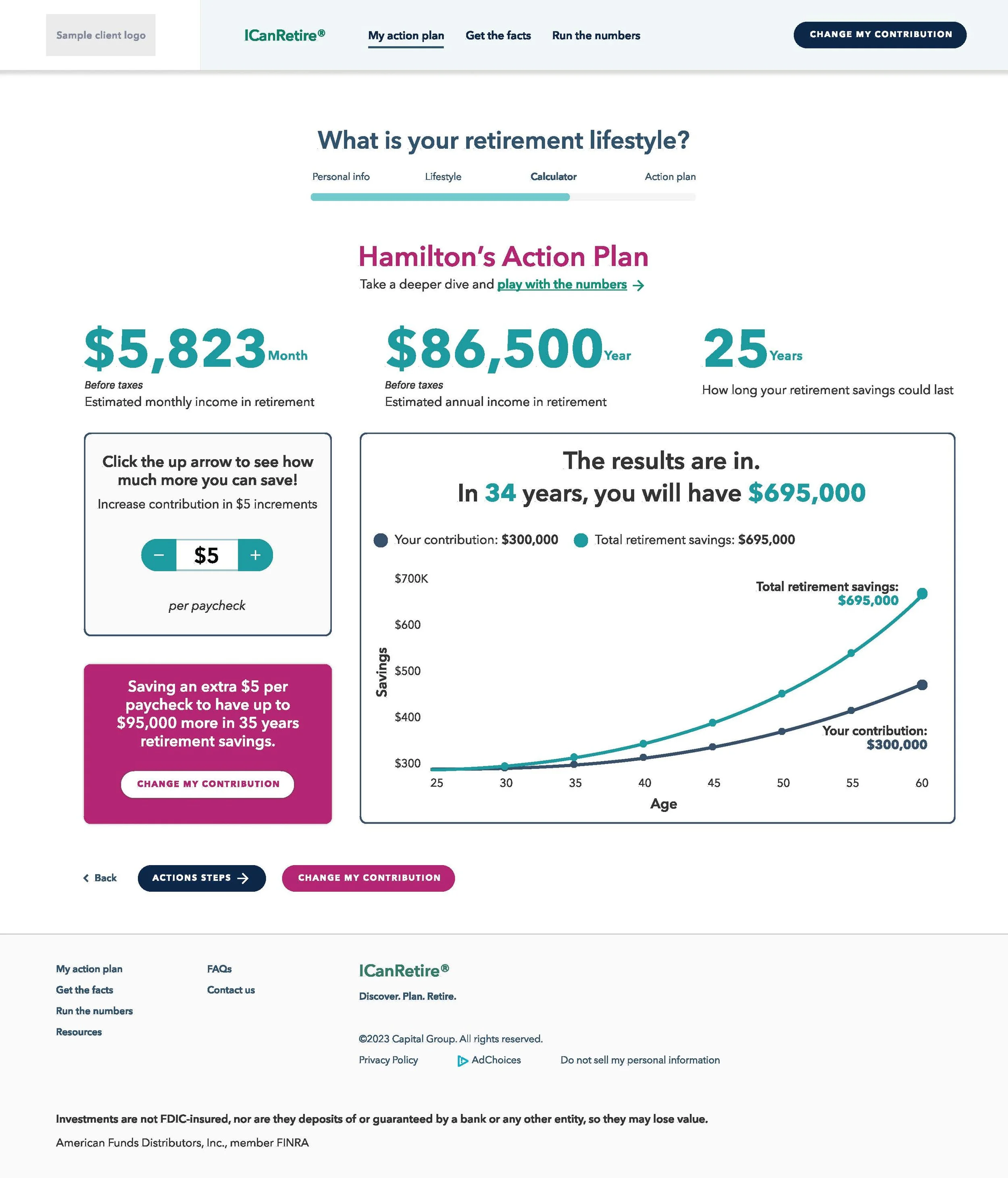
As part of the redesign, I helped shape a rules-based calculator experience that offered more customized outputs based on user input. This made the core CTA feel more relevant and useful, rather than generic.
Outcomes
-
The team completed the redesign in time to support the onboarding deadline for a new client with 70,000 employees. Lean UX methods and AI-augmented workflows helped make that timeline achievable.
Link here: https://www.icanretire.com/generic
-
The redesigned experience doubled engagement for a $282 billion product line representing 40.5% of new sales, showing that clearer structure and stronger relevance improved how users interacted with the site.
-
The redesigned experience earned four industry awards, including first place in the “Promoting Employee Participation” category.
-
By using in-house designers for higher-value work, augmenting their abilities with AI tools and outsourcing user recruitment, the team saved $125,000 while still delivering a high-quality redesign on schedule.